E-Commerce Product Detail Page
Project Overview
Our team was brought on to provide UX solutions for one of the largest promotional products companies, specializing in customizable items like pens, mugs, and apparel for businesses of all sizes. They engaged our UX team to redesign their studio experience, aiming to enhance usability and streamline the customization process for their diverse customer base. Our goal is to create a next-generation studio experience that improves user flows, simplifies customization, and aligns with business objectives.
Role: UX/UI Designer | Tools: Figma & Userlytics | Duration: 1 Year
UX Research
Stakeholder Interview
Background & Goals
The UX research aimed to understand stakeholder definitions of success for the Next Generation Studio project, identify user pain points in configuration, and explore ways to improve the studio experience. The study involved interviews with 29 stakeholders across various roles, including leadership, marketing, sales, and customer service.
Key Findings & Recommendations
-
Issue: Users face excessive pre-configuration steps before accessing the studio, lowering conversion rates.
Recommendations:
Reduce the number of pre-configuration steps.
Display color/size inventory on the product details page.
Allow users to start designing sooner.
-
Issue: Fixed logo and text placement creates unwanted white space, causing reprints and delays.
Recommendations:
Enable drag-and-drop customization for text and logos.
Provide users with guidelines for placement adjustments.
-
Issue: Enterprise clients prefer consumer-style experiences like those on Amazon and Canva.
Recommendations:
Improve UI with high-quality images and modern templates.
Introduce human models for better product visualization.
Streamline navigation to allow faster design access.
-
Issue: Setup fees, shipping costs, and color limitations appear too late, surprising users.
Recommendations:
Make additional costs transparent early in the process.
Show an incremental subtotal as users add design elements.
Provide clear information on backorders and color limitations.
-
Issue: Users struggle to preview designs accurately.
Recommendations:
Implement realistic 3D product previews.
Clearly label image previews and imprint areas.
-
Issue: Users cannot apply stored logos across multiple products, leading to inefficiencies.
Recommendations:
Enable automatic logo placement across multiple templates.
Allow users to save and reuse artwork.
-
Issue: Current templates and stock art look outdated.
Recommendations:
Update templates and stock art regularly.
Allow users to customize modern templates like Canva.
-
Issue: Popular items run out of stock, leading to missed sales.
Recommendations:
Improve inventory tracking and communication.
Notify users about low stock before checkout.
-
Issue: Image uploads take too long, and users lose progress when the system times out.
Recommendations:
Improve image upload speeds.
Implement autosave or a draft mode.
-
Issue: Users lack flexibility in text styling, logo placement, and scaling.
Recommendations:
Add more font styles and curved text options.
Introduce drag-and-drop functionality.
Provide clearer design boundaries.
Through stakeholder interviews, we identified key pain points affecting the studio experience. While many of these recommendations fall under UX, some findings require collaboration with other business units, such as Development, Operation, Marketing, and Production.
Personas
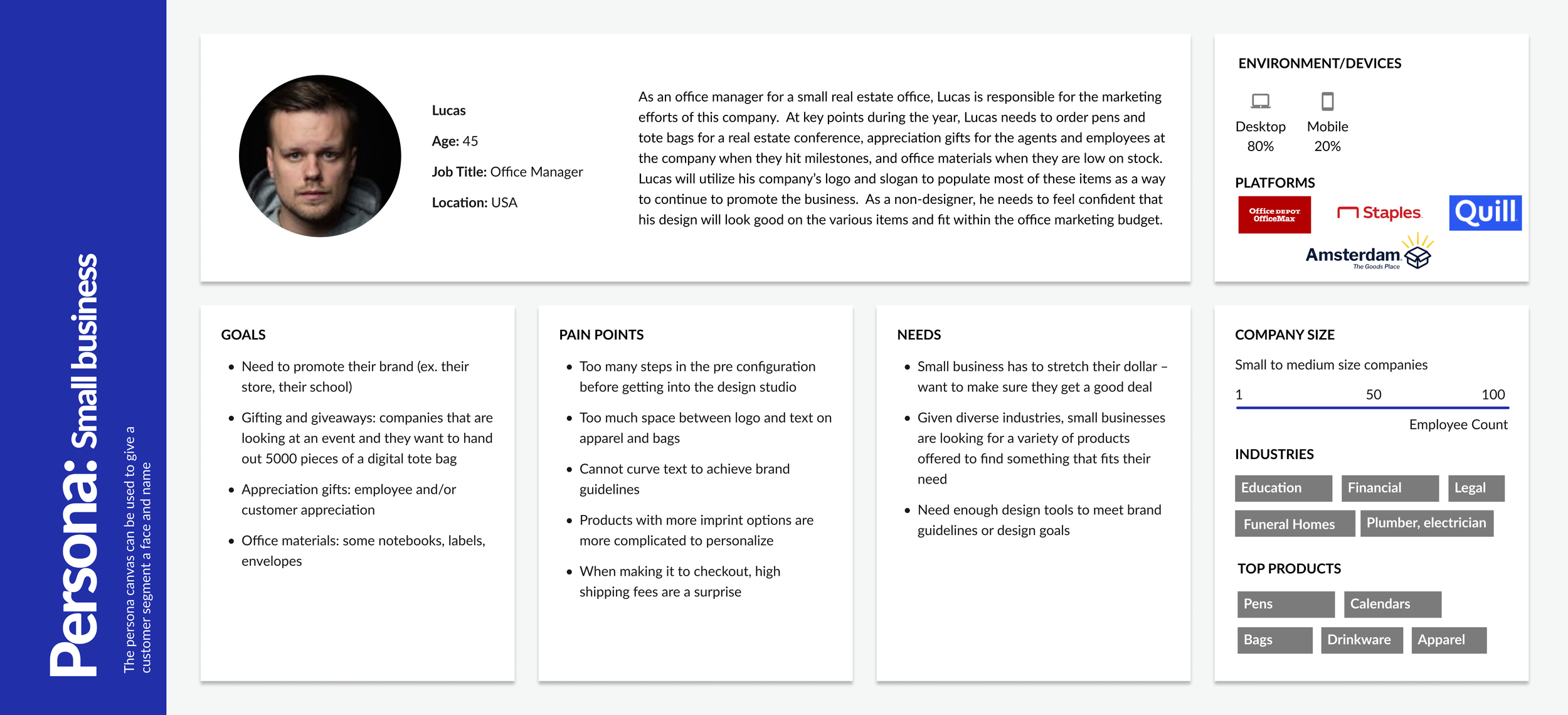
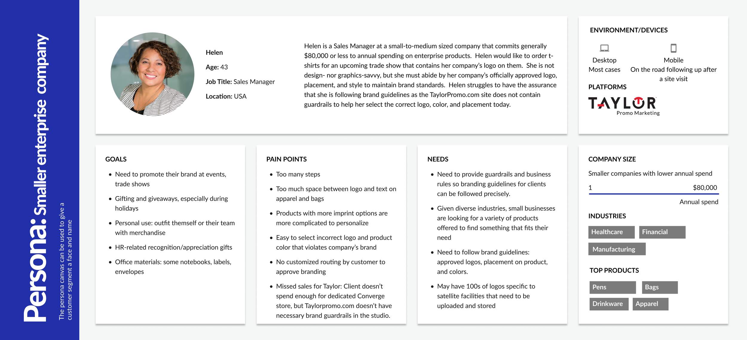
Since redesigning the studio experience is complex—offering numerous features for users to customize their promotional products while serving various businesses with the same configurator—I created personas to help my team focus on key user flows and serve as a shared reference for designers, developers, marketers, and stakeholders. This ensures alignment across teams and allows us to prioritize solutions that create the most impact.
User Flows
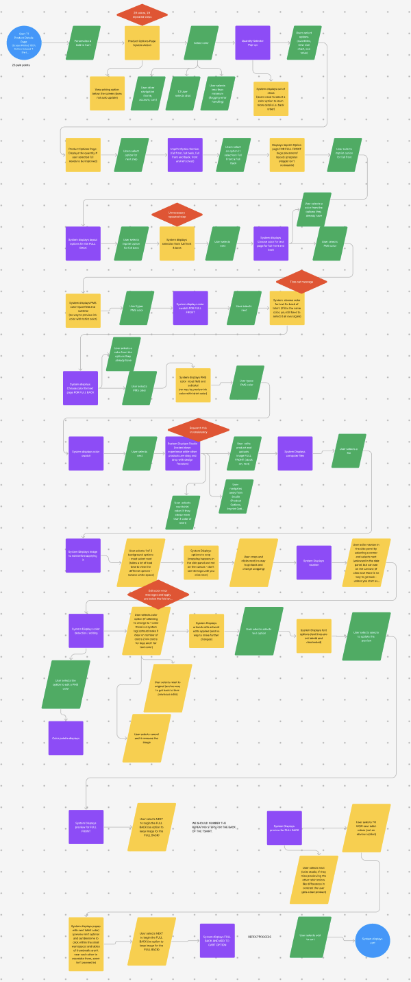
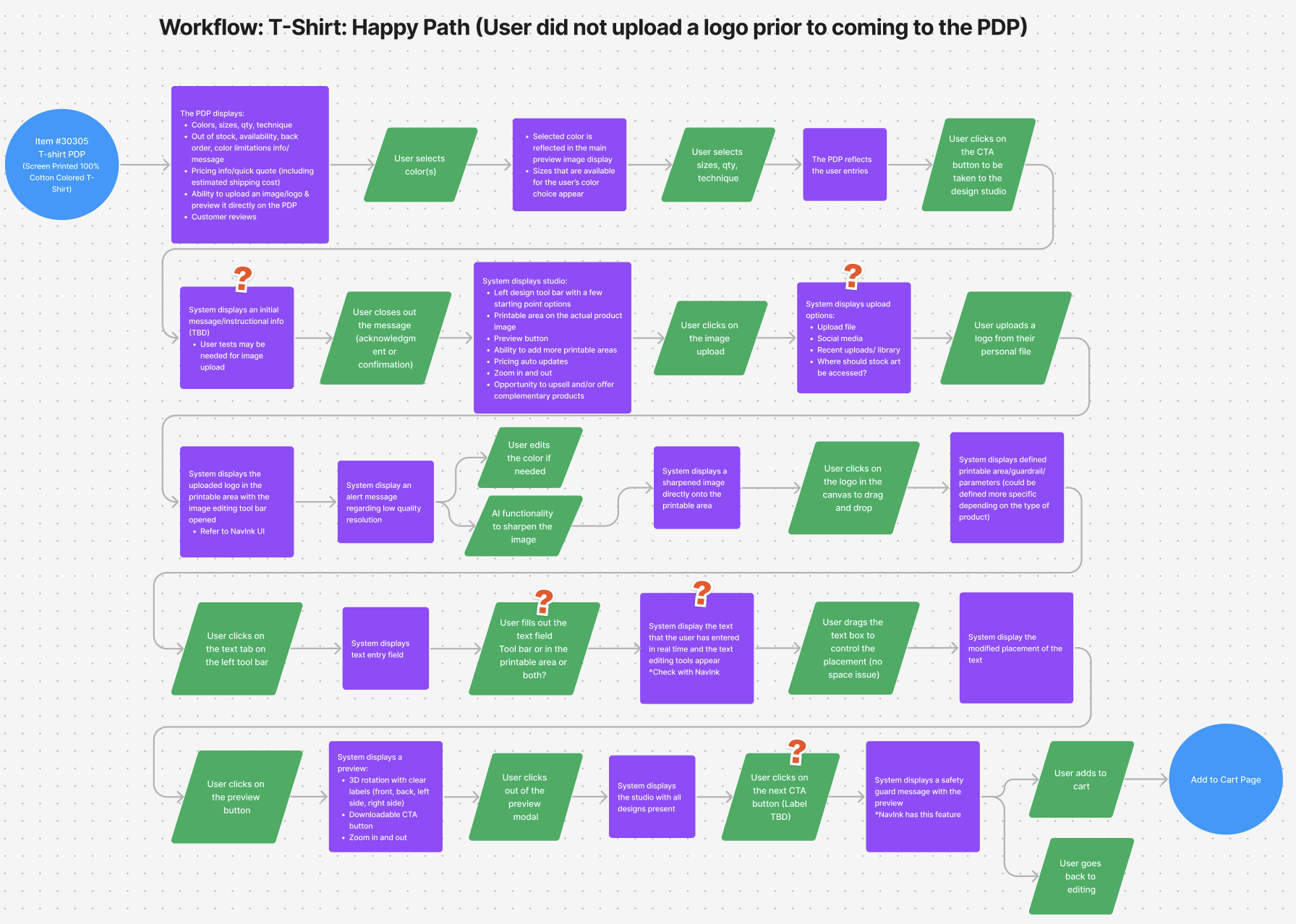
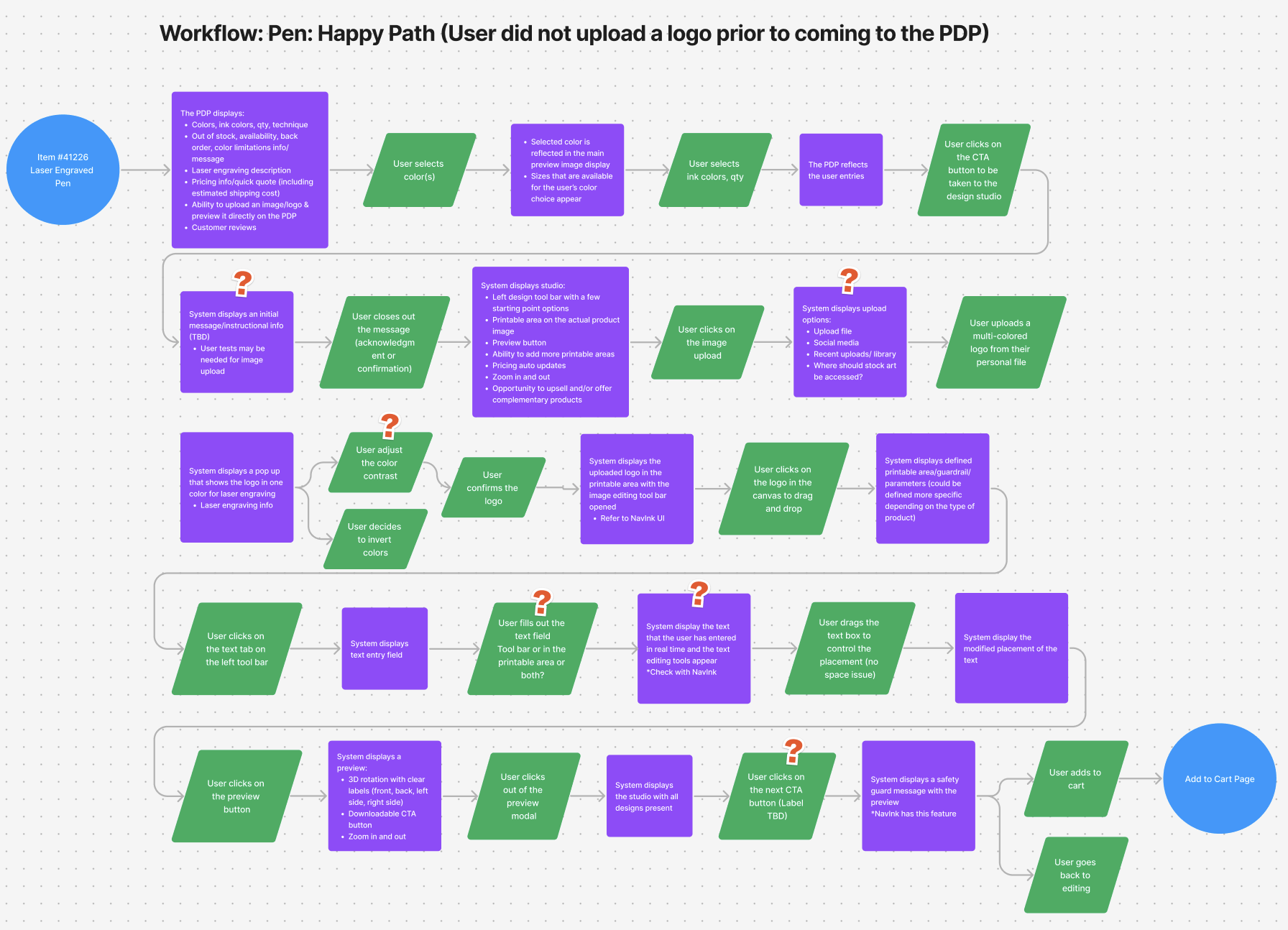
To highlight the users' 23 pain points we identified in the current studio experience, my colleagues and I conducted a workshop to map out user flows for the current studio. After doing our own competitor analyses, we designed ideal flows for the next-generation studio experience, ensuring alignment with our personas and addressing key challenges.
The first image shows the current studio user flow, while the other two images show ideal user flows for two different products.
Legends
Green rhombus= user action/ decision point
Purple square = system action
Yellow shapes = pain points
Design System
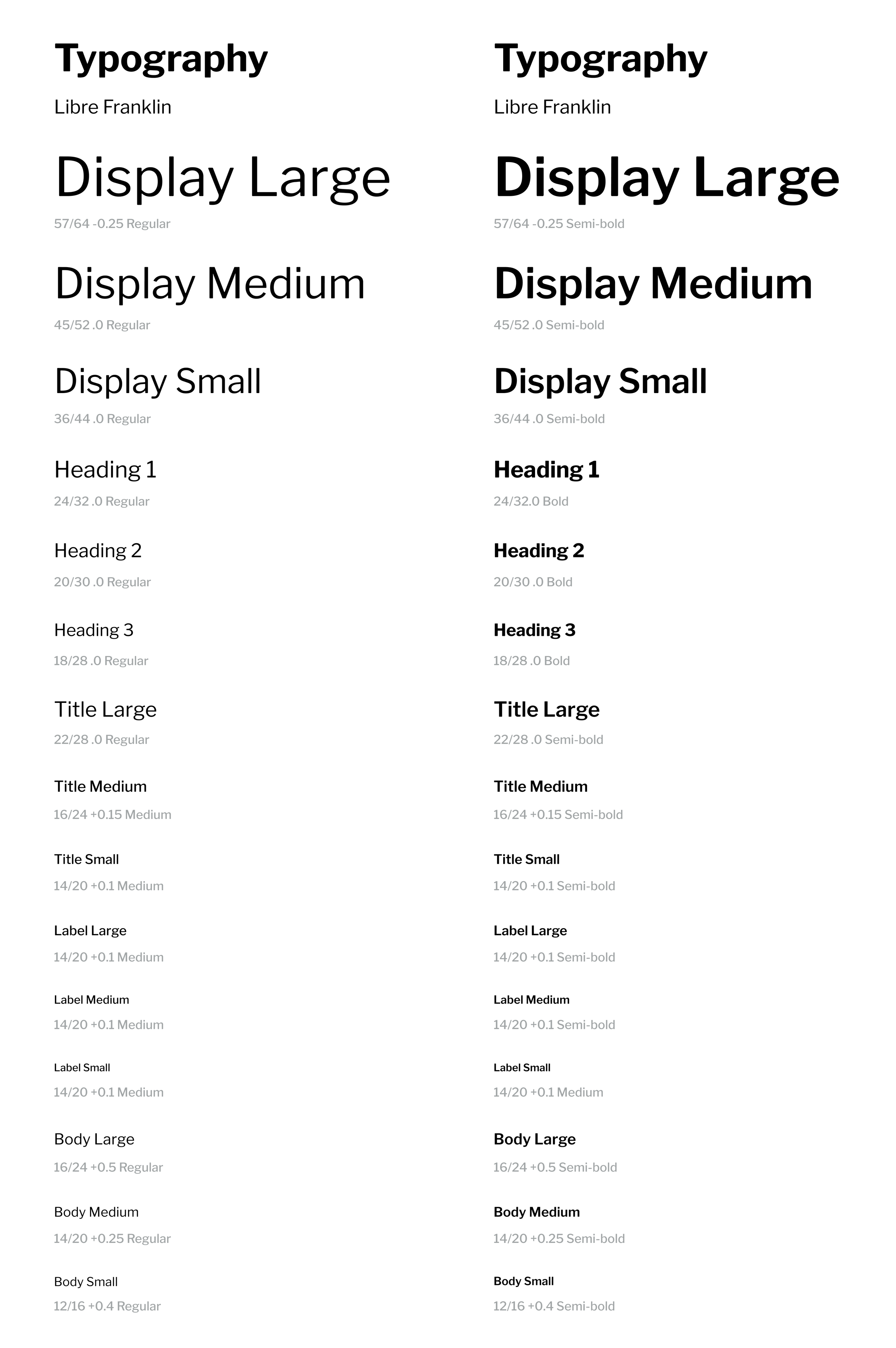
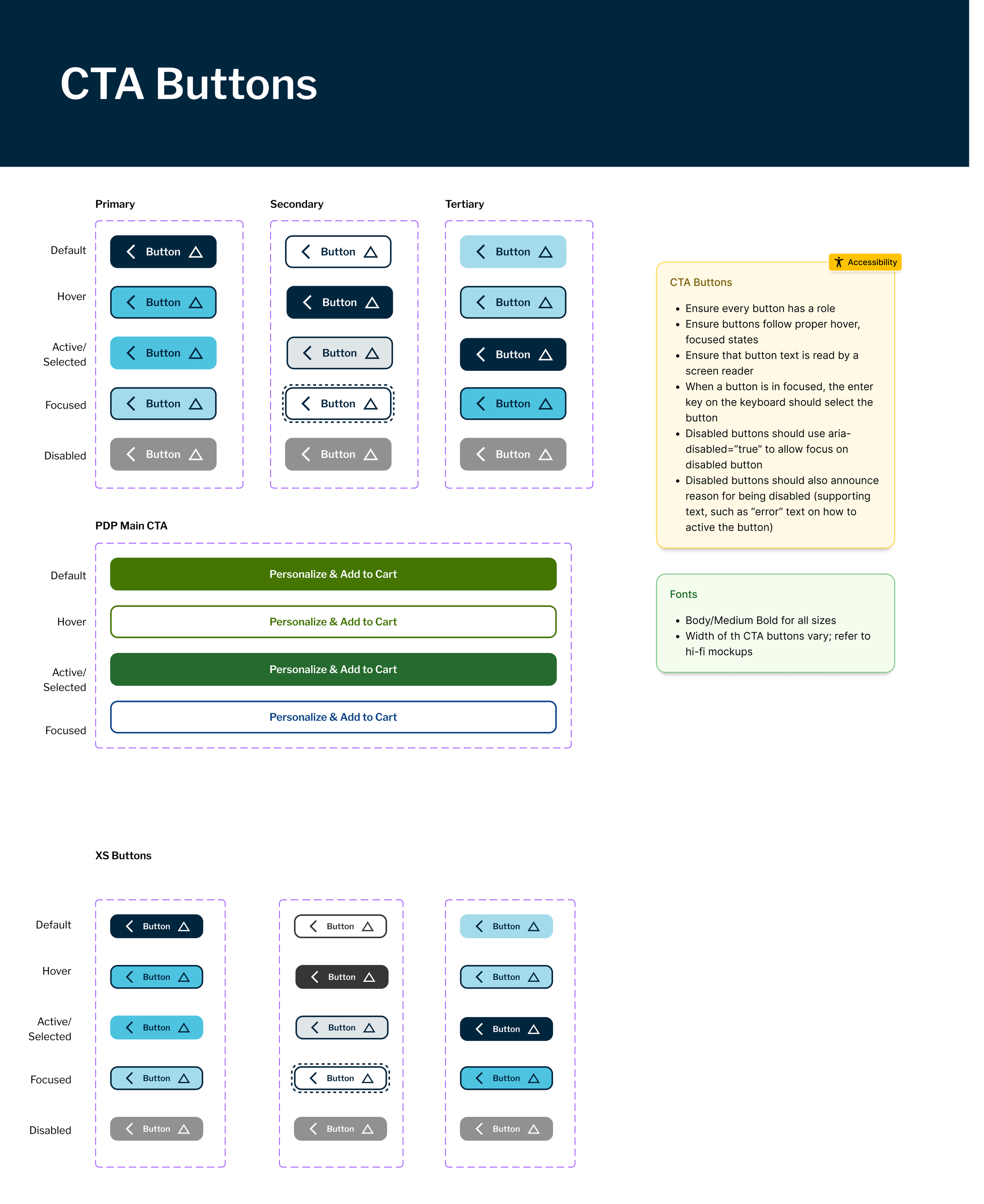
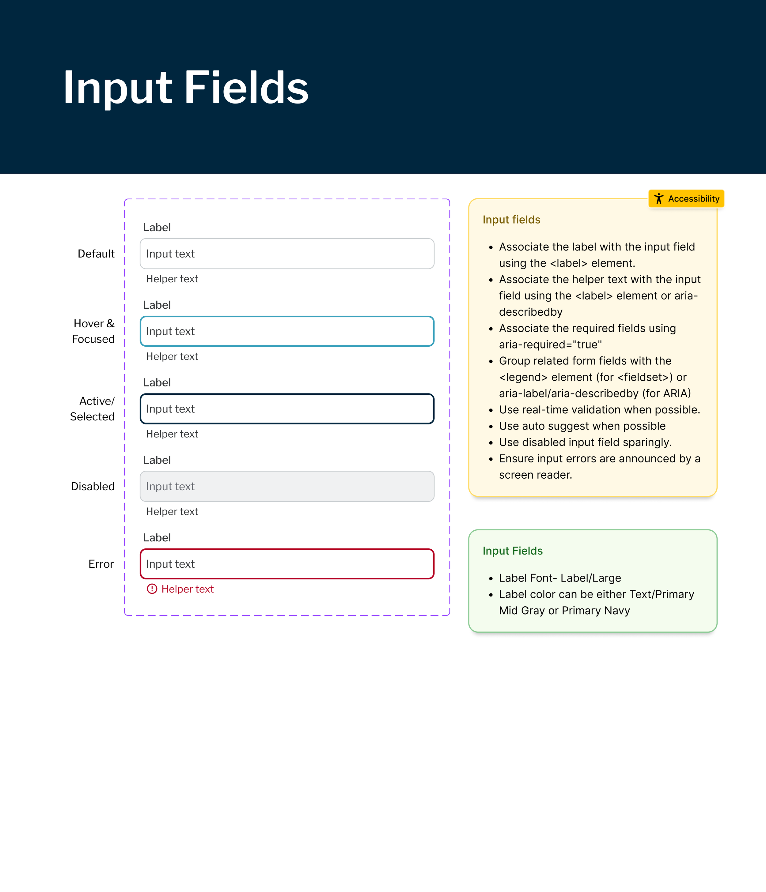
I took on the responsibility of setting up the design system in Figma, creating components, and maintaining the library, as I was the most familiar with the Figma tool on our team. To ensure seamless collaboration among the three designers, including myself, I structured the system to align as closely as possible with Material Design—incorporating its font sizes, breakpoints, icons, spacing, etc. This not only provided a familiar experience for users but also streamlined the handoff process for developers.
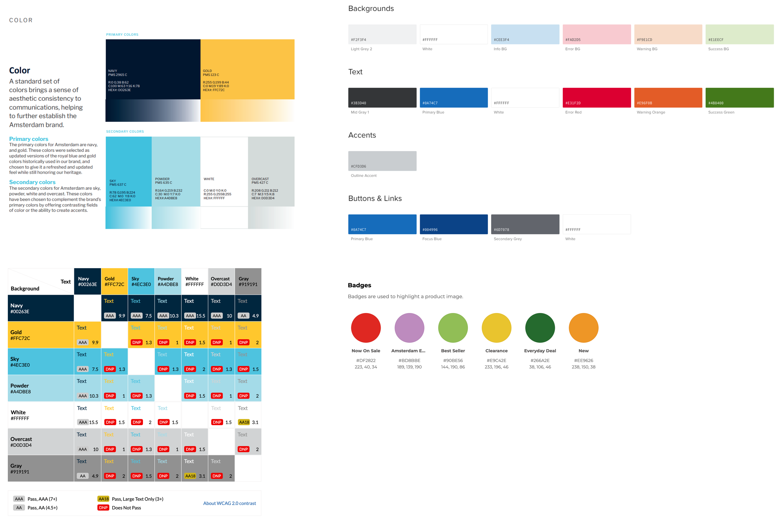
Below are a few examples of the style guide I created.
Accessibility
From the start of this project, we prioritized accessibility and adherence to WCAG guidelines. In addition to ensuring all components met accessibility requirements by consulting with our certified Accessibility coach regularly, I created a color chart upon receiving the brand’s color palette. This chart highlighted which color combinations met accessibility standards and which did not, ensuring all designers knew which ones to avoid.
Product Detail Page
Project Scope Change
The client’s initial request was to enhance the studio experience, where customers design promotional products. However, after evaluating the overall user journey leading into the studio, we recommended expanding the project scope to include the product detail page. This decision was driven primarily by our first key UX research finding—too many steps. While my colleagues focused on designing the studio experience, I began by working on the product detail page.
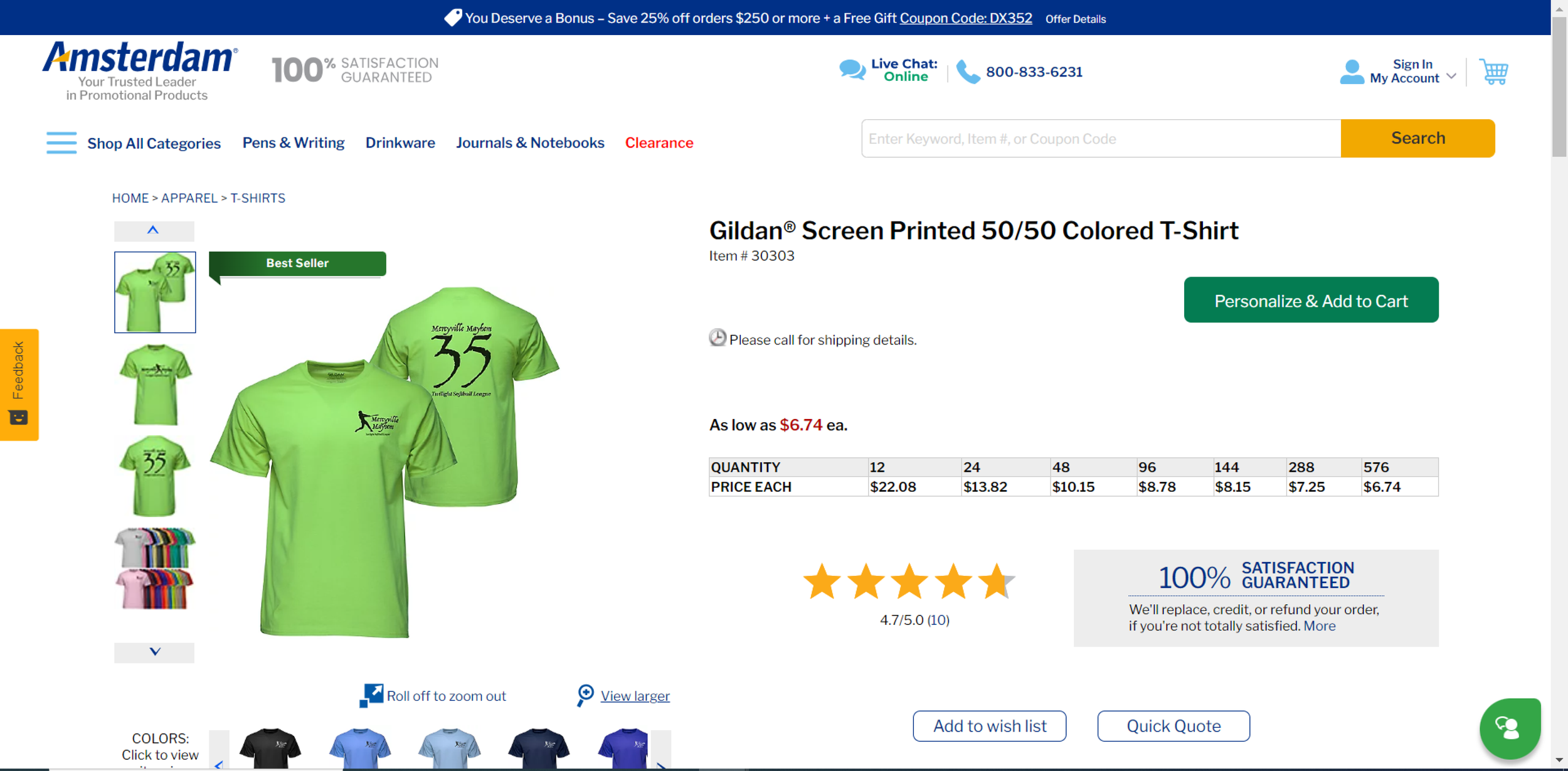
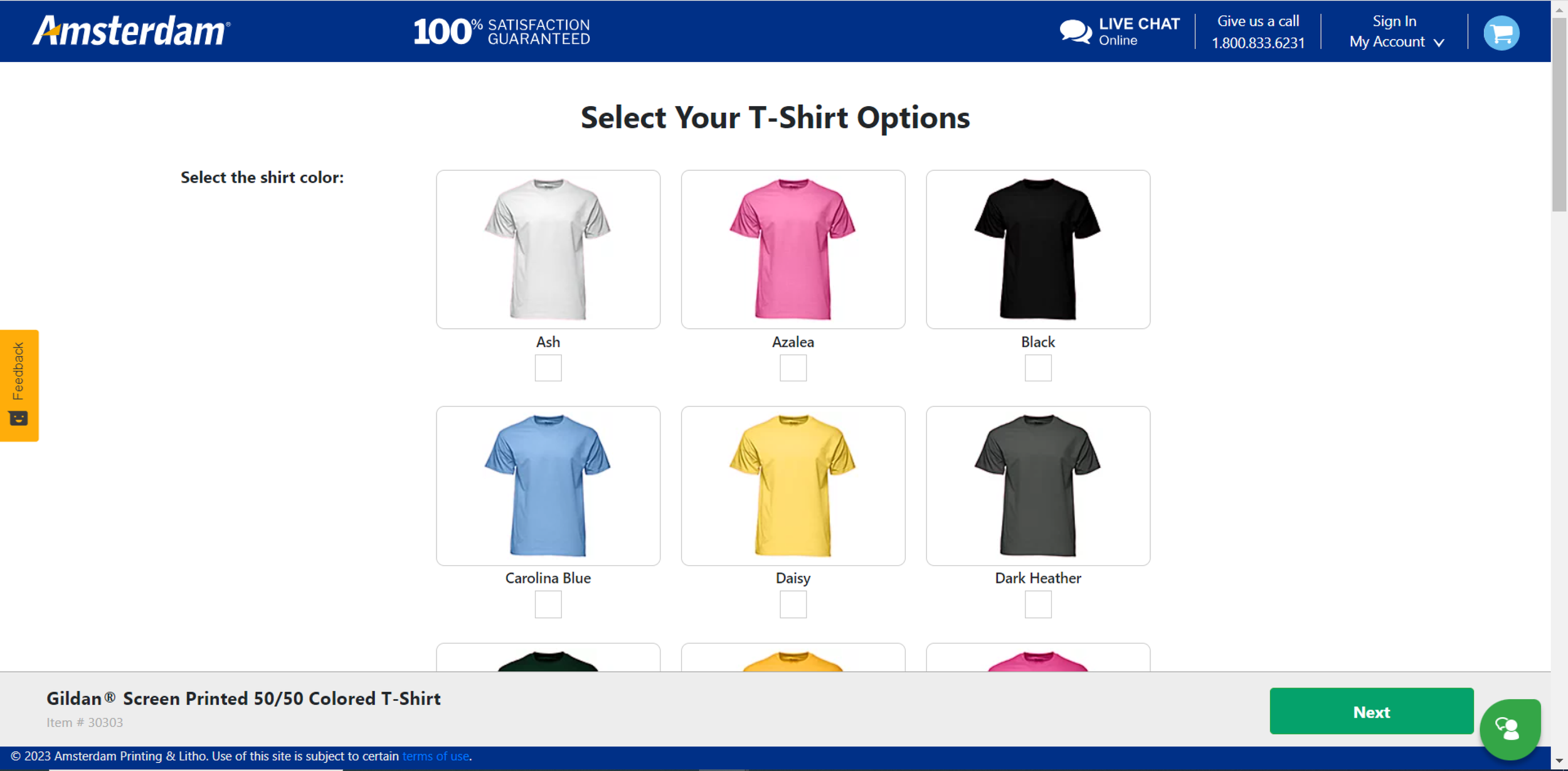
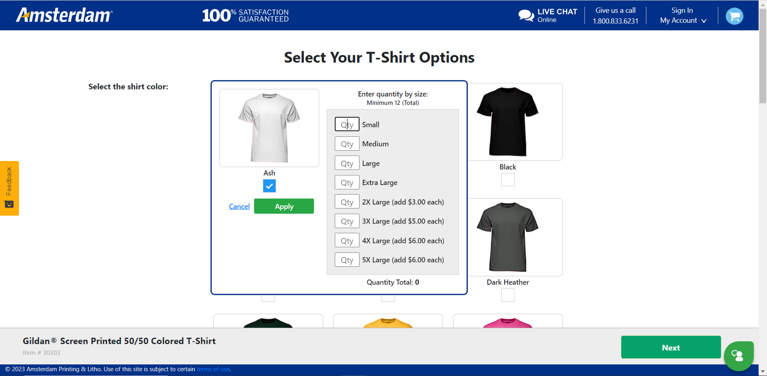
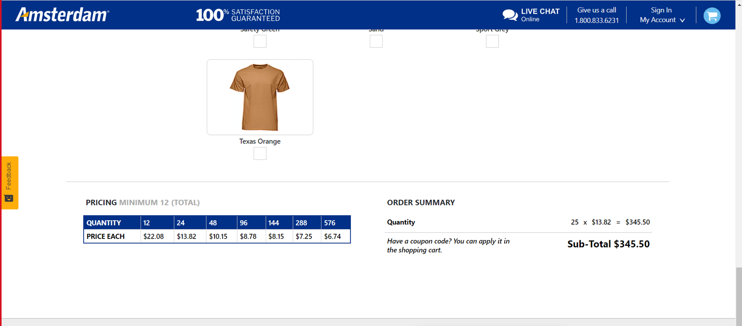
Below are a few screenshots of the current product detail page and additional steps before entering the studio.
High Fidelity Mockups
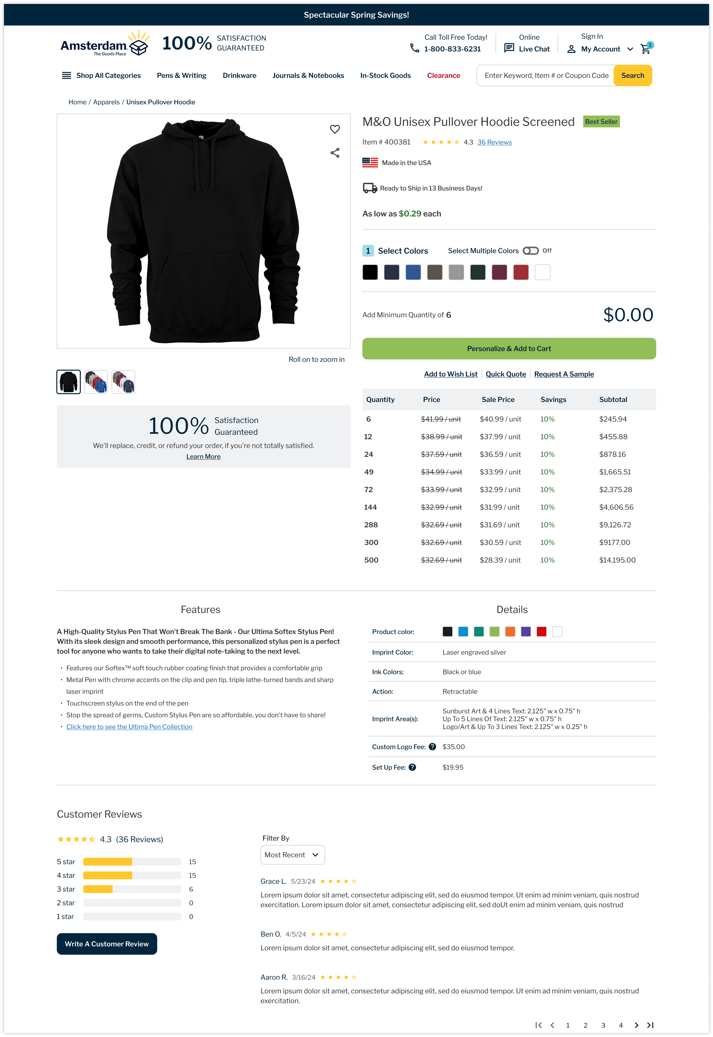
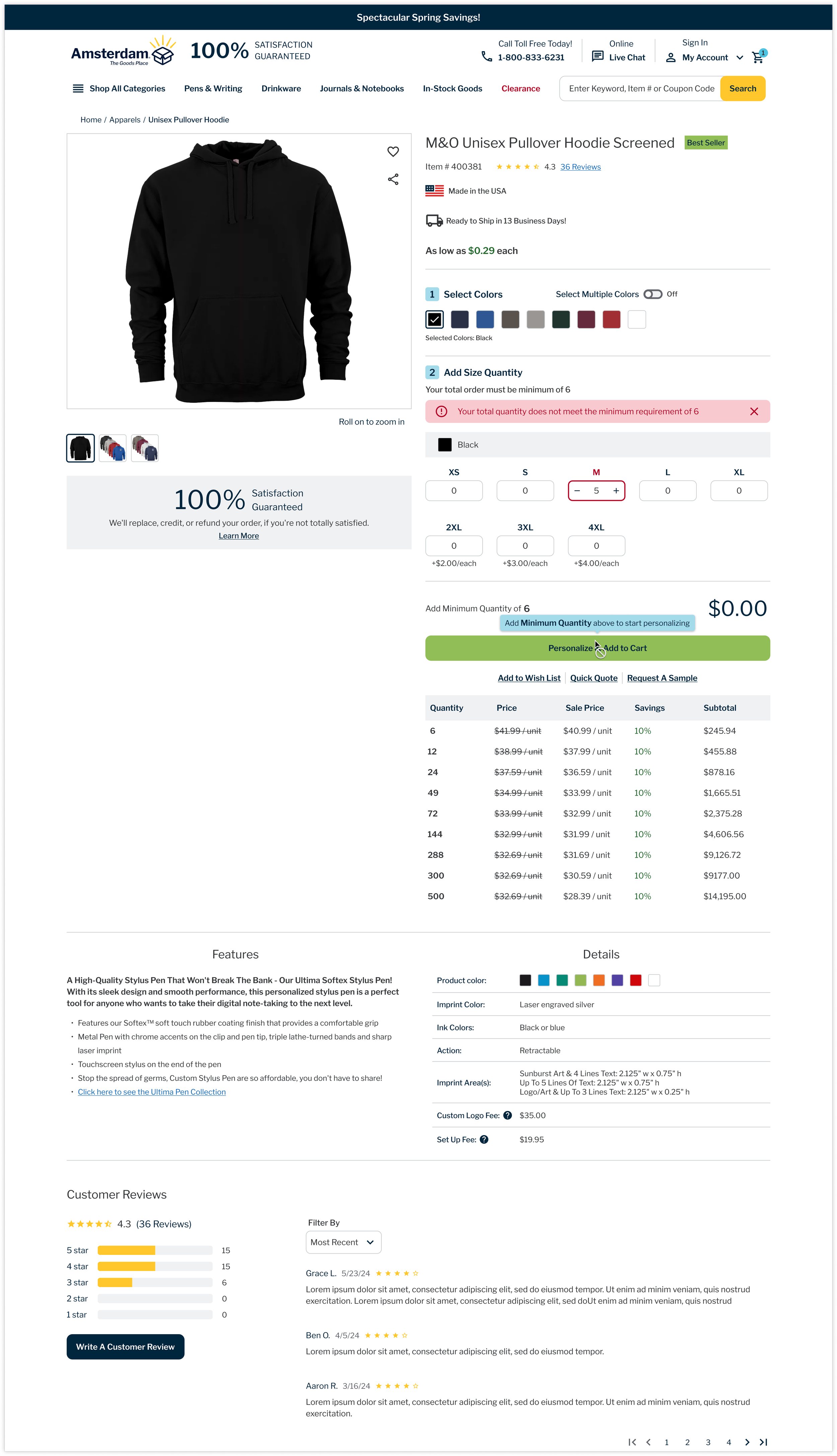
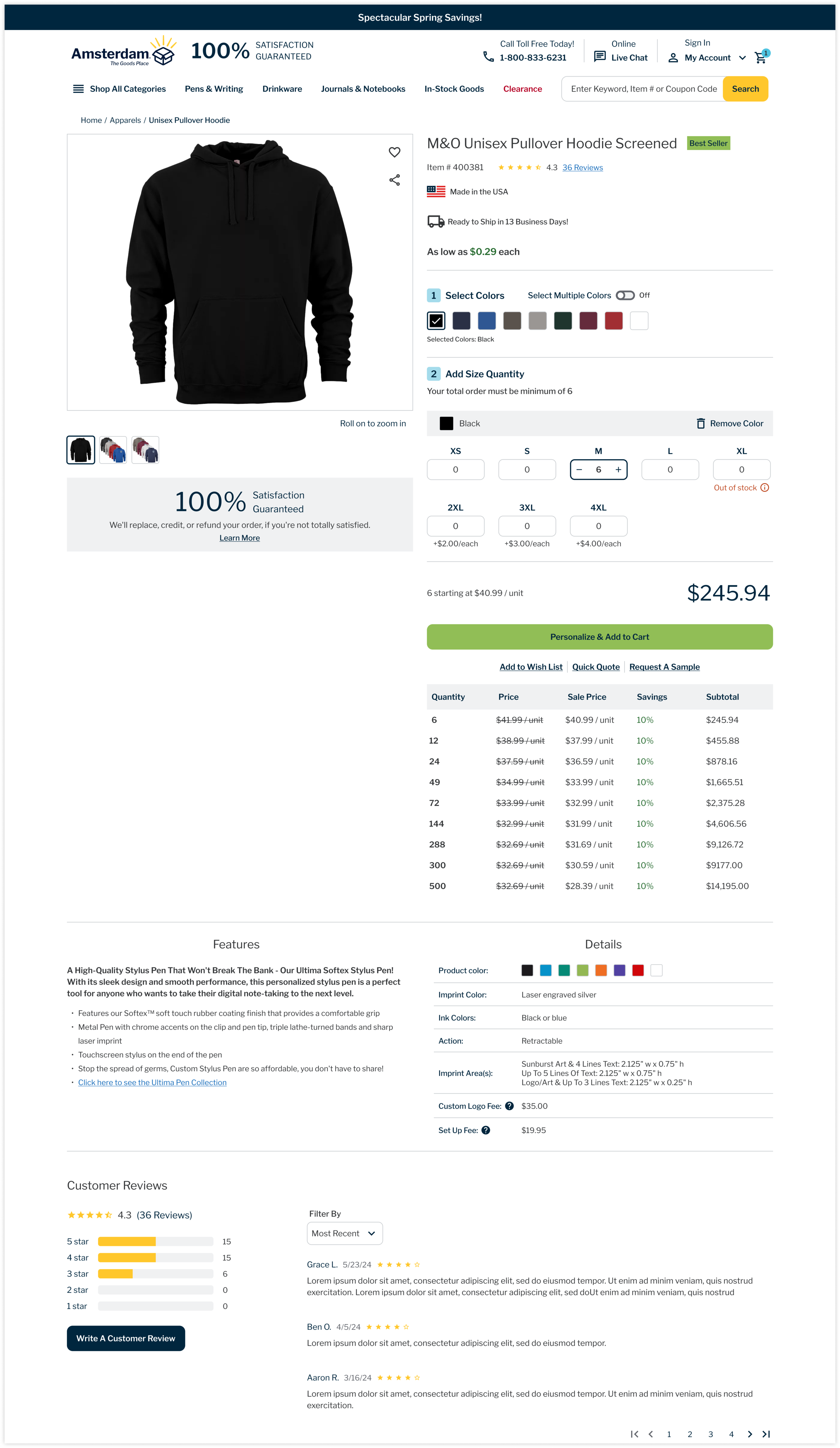
Since we had already mapped out the user flow for the product detail page, I was able to get started immediately. After months of iterations, consistent communication with the client (including personnel from Marketing, Development, and Executives), and numerous usability tests via Userlytics to confirm my design solutions, I arrived at the version shown below.
This new version of the product detail page addresses two major findings from our research: too many steps in the process and key details appearing too late.
Highlights
Instead of navigating through multiple pages and steps before entering the studio, users can now make essential selections (such as colors and quantities) directly on the product detail page and be directed to the studio right away.
One critical usability issue we identified during our UX audit before starting the next-generation studio project was the lack of visible subtotals earlier in the process. All 6 participants in the audit struggled to stay within their budget due to the price calculations being hard to find. I made sure to prioritize key information, such as inventory and pricing, to ensure users wouldn’t miss it.
One unique aspect the client wanted to retain from their previous user journey was the ability for users to select multiple colors from a single product on the product detail page. While it’s more common among competitors for users to select one color and then choose additional colors within the studio, the client wanted to display all available colors and options. We recommended against this approach because it could make the page too long and cluttered. As a compromise, we introduced a toggle to enable users to select multiple colors. This way, users can still explore color options without overwhelming the page with lengthy quantity selections.
Challenges
Our team took on a multifaceted role, not only designing the experience but also driving the project plan in the absence of a project manager. We were responsible for creating user stories, prioritizing tasks based on business needs, and highlighting key decisions for leadership.
Throughout the process, we navigated input from numerous stakeholders—many without UX expertise—who had strong preferences that at times conflicted with best design practices.
A key critique from stakeholder interviews was that the current site prioritizes the production process over user experience. Our team faced numerous design constraints driven by backend limitations, which we were unable to modify.
A lack of adequate data collection infrastructure hindered our ability to make fully informed design decisions. Recognizing this gap, the client is now seeking a third-party analytics team to provide more accurate insights to guide future improvements.
Next Steps
Monitor Performance
After our development team implemented the product detail page on the live site, our team identified several usability and accessibility issues that still need to be addressed. The development team is aware of these concerns and will continue refining the experience. According to a recent report from the third-party analytics company hired by our client, the product detail page is performing well. However, as it has only been live for a month and still issues some UX issues, it is still too early to gather substantial data.
Studio Configurator
Significant progress has been made on the next-generation studio experience, which is being developed in two phases due to its complexity compared to the product detail page.
Phase 1 focuses on UX improvements and a refreshed UI while maintaining much of the current workflow.
Phase 2 will introduce more substantial enhancements and structural changes to the experience.
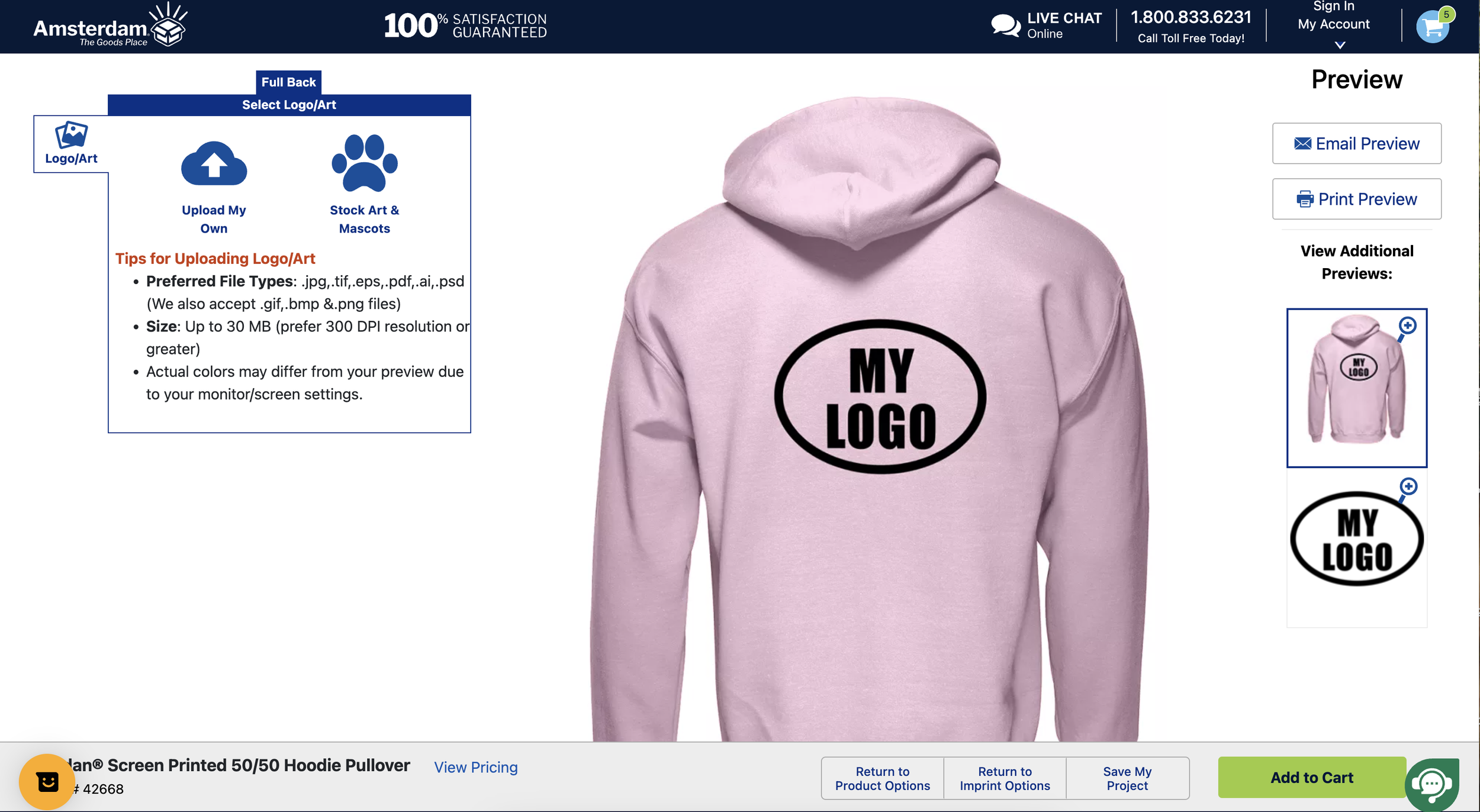
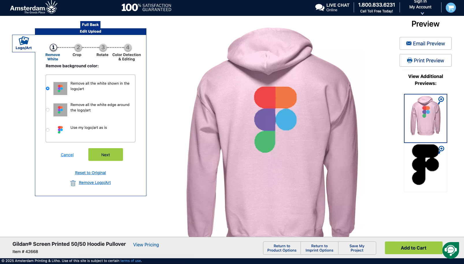
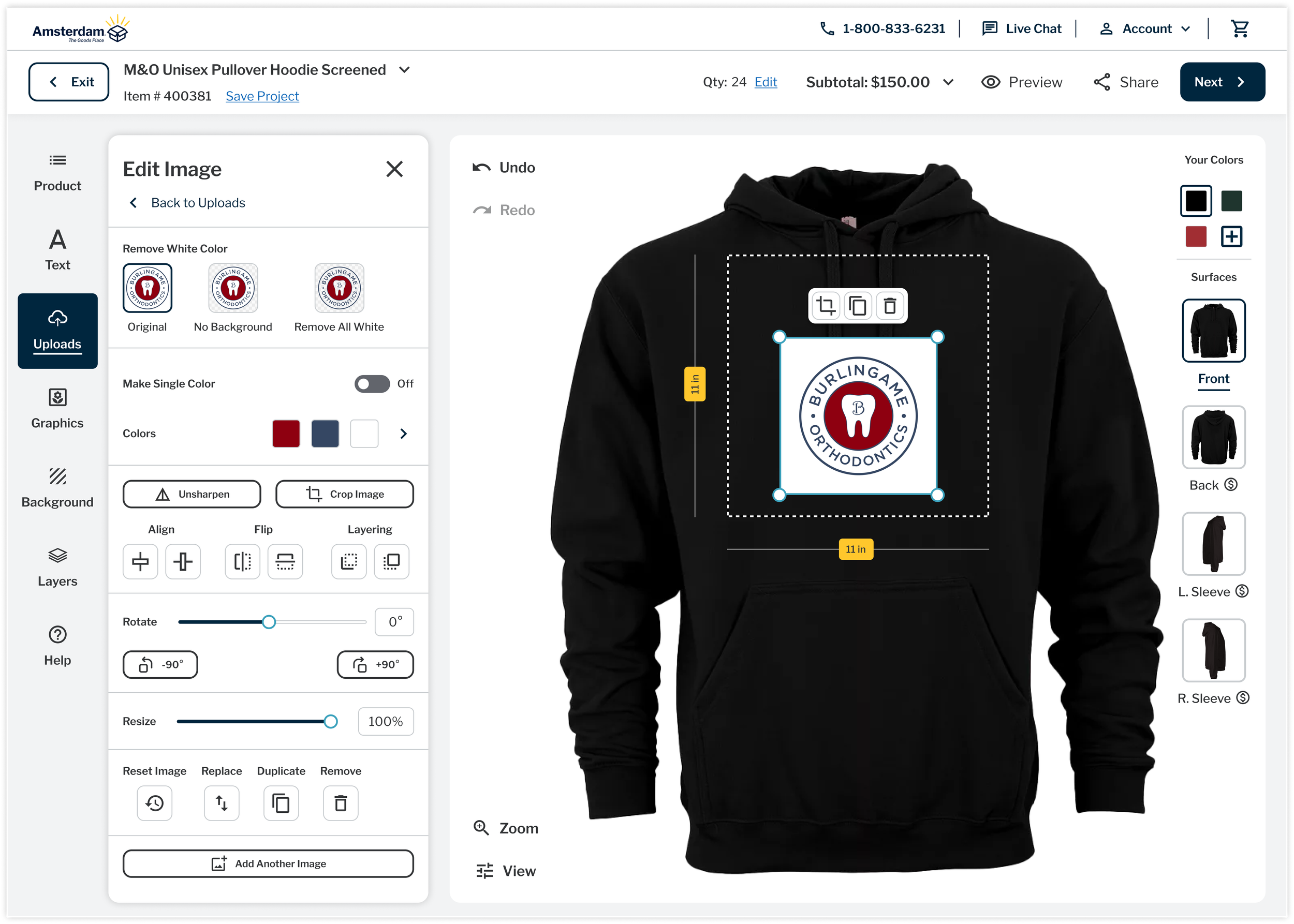
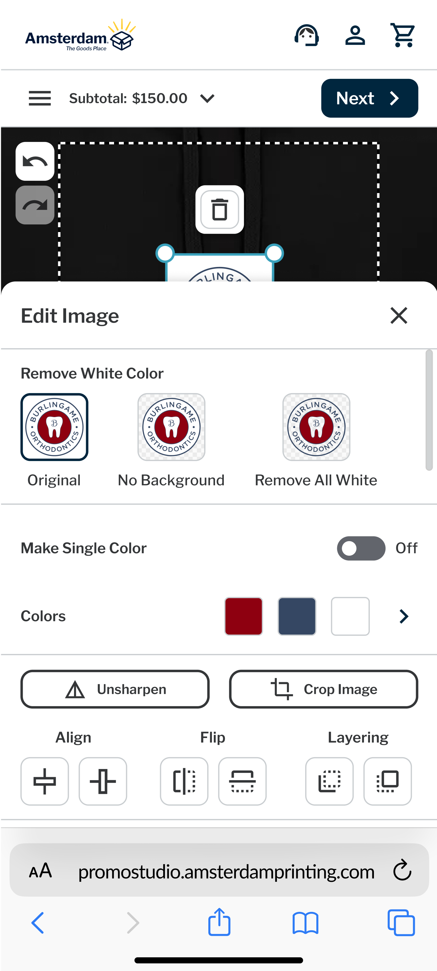
Many user stories have been approved and handed off to the development team with supporting documentation, though implementation has not yet begun. Below are examples of the current studio design (top) alongside high-fidelity mockups of the new experience (bottom) that I designed.
