Admin Portal
Project Overview
The Admin Portal is an integral component of a comprehensive business management solution, designed to empower companies to execute marketing campaigns effectively and make informed, data-driven decisions. Our primary objective was to develop an administrative tool that enables Account Managers to efficiently configure tailored business management solutions for their clients.
Role: UX/UI Designer | Tools: Figma & UserTesting.com | Duration: 3 Months
Problem Statement
Currently, the setup of a new client's business management solution involves Account Managers submitting a Microsoft Form containing the client's customization details to the development team. However, this process is unsustainable and prone to miscommunication as the platform expands and undergoes continuous enhancements.
Research Analysis
Secondary Research
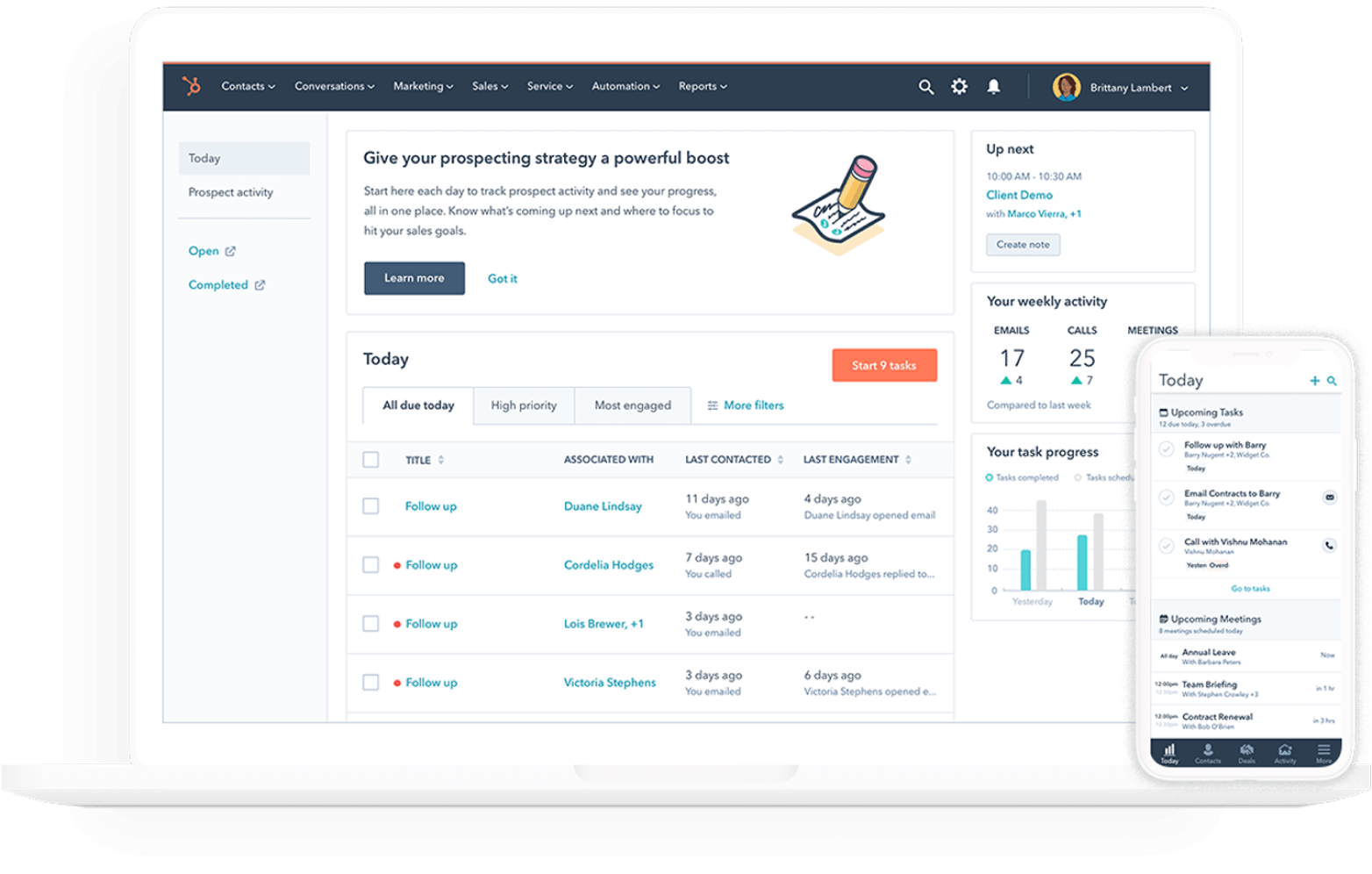
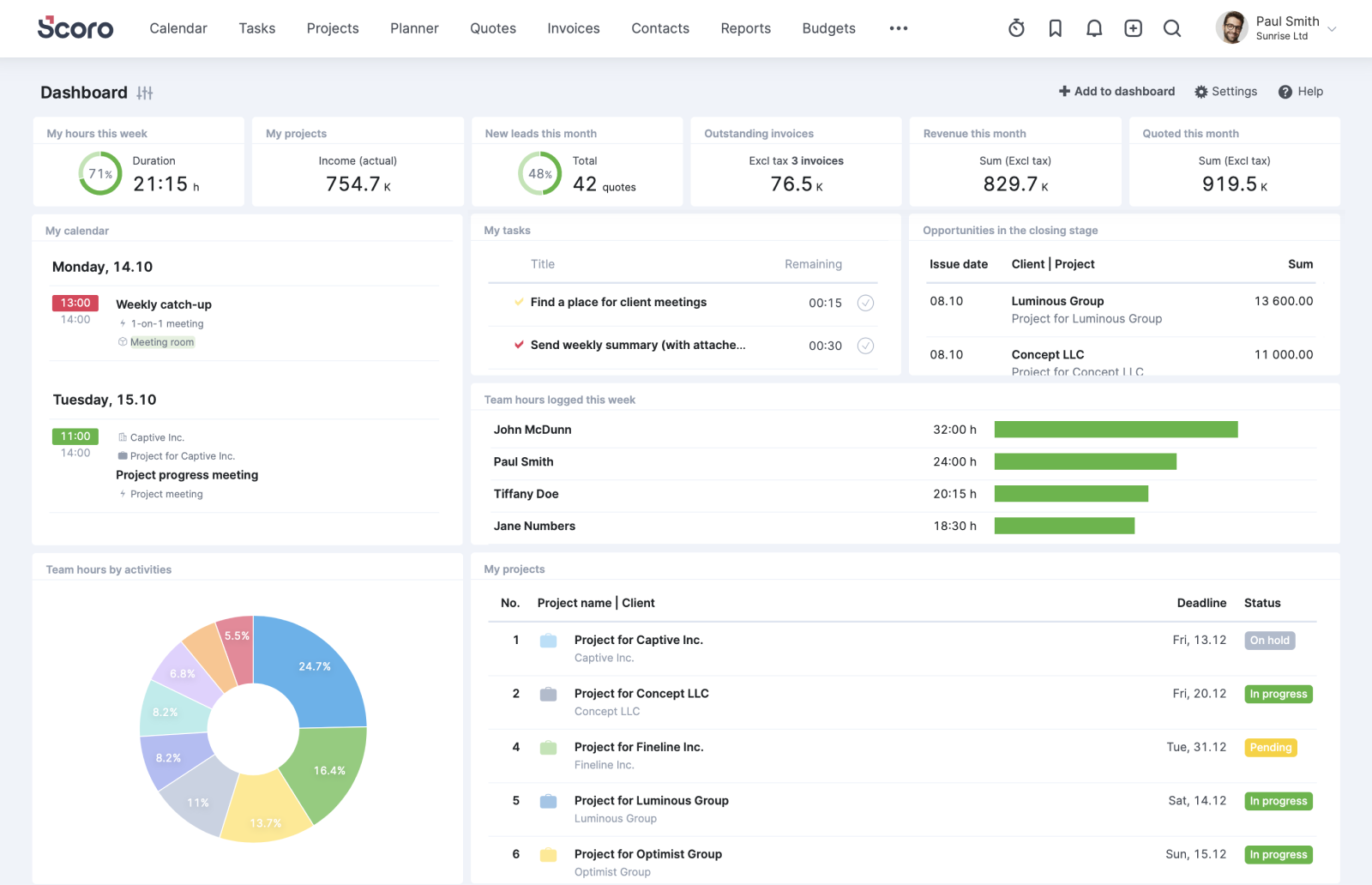
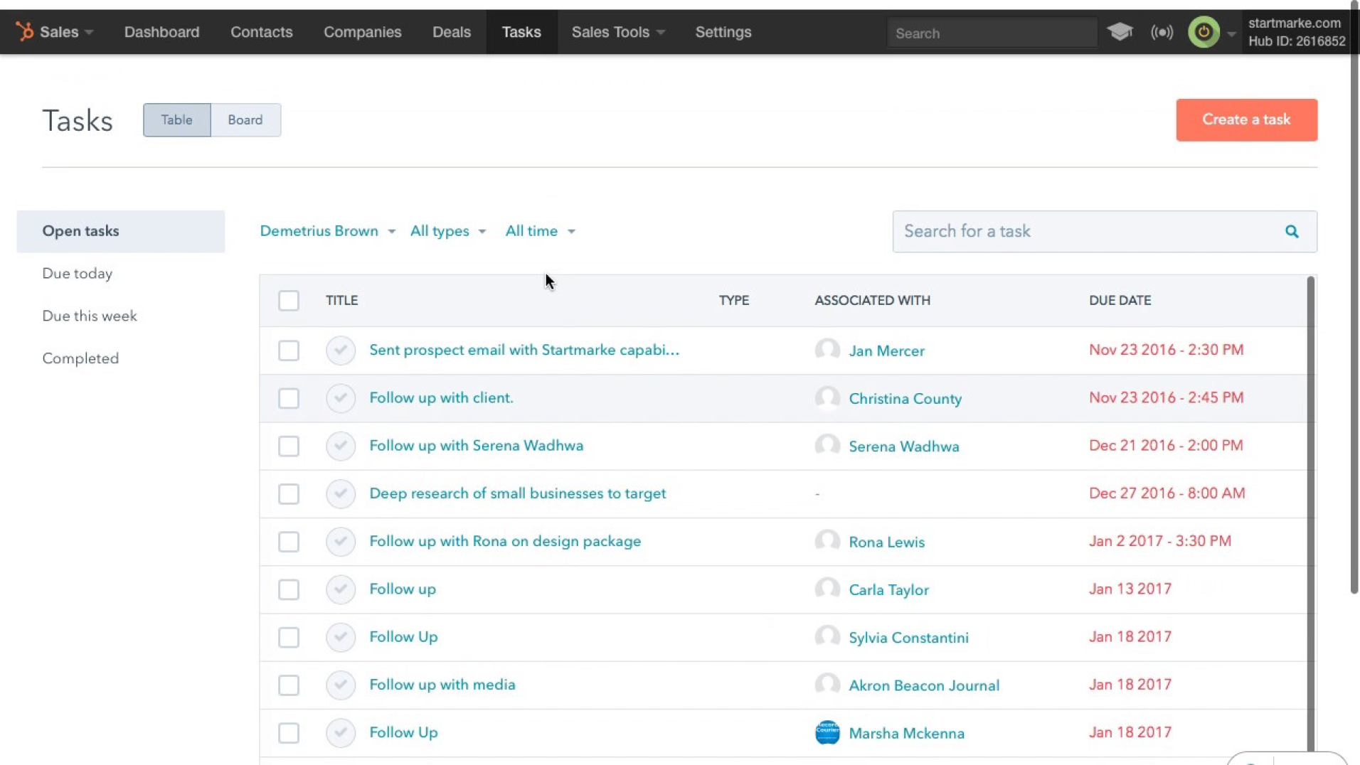
Given our constrained timeline and limited resources, we were unable to conduct primary research. Consequently, my colleague and I primarily depended on the IT project manager to gain insights into the current process and the stakeholders' vision for streamlining the customization workflow. My objective through secondary research was to identify user flows and design elements from other companies offering similar business management solutions: Hubspot, Scoro, and UXPin.
My secondary research established the following:
Identification of two key user flows:
- Create a new account
- Edit an existing accountDefinition of the overall UI style, including:
- Utilization of widgets
- Adoption of a modern aesthetic
- Exploration of a tile-based display
Visual Design
Wireframes
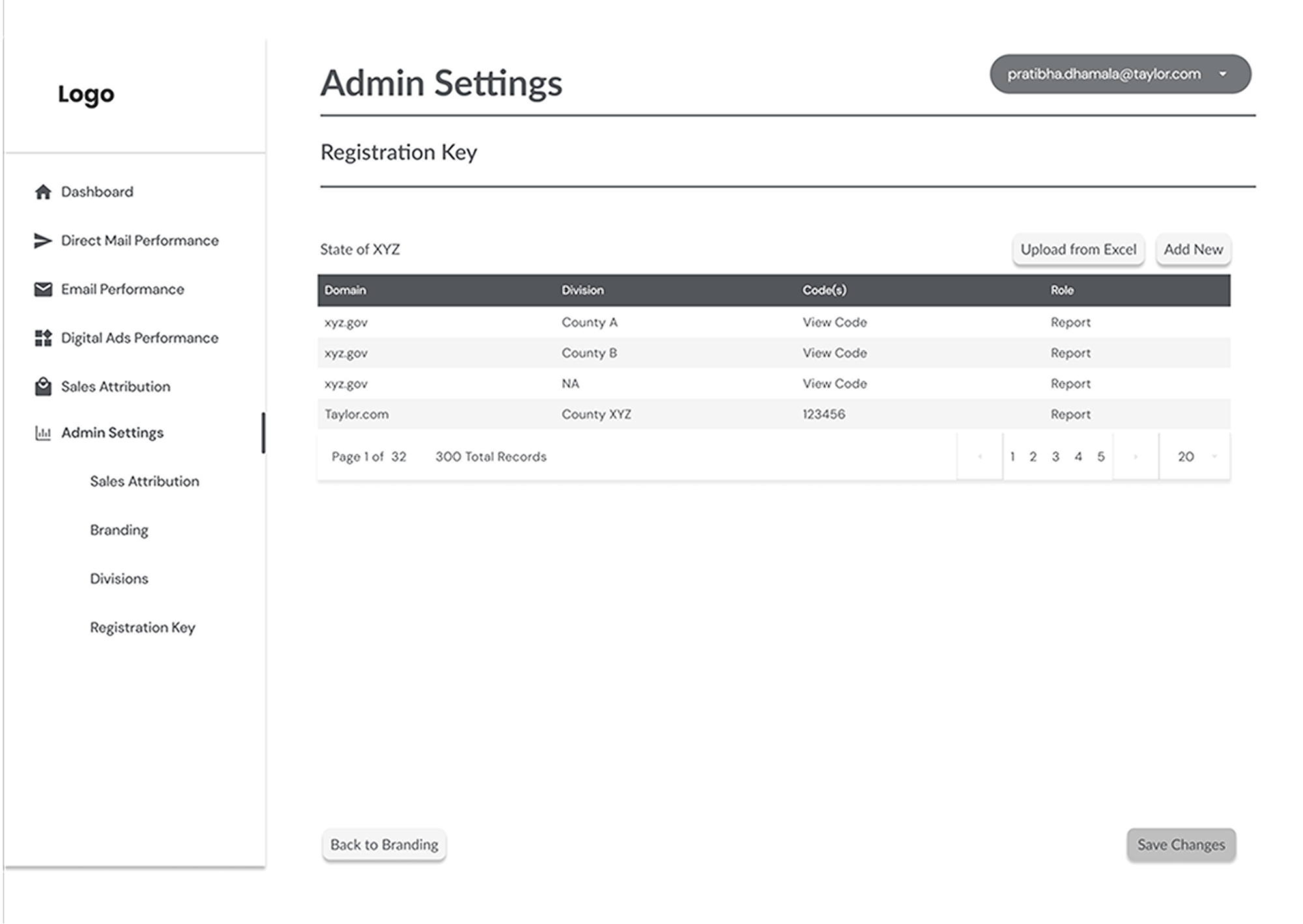
Leveraging design concepts provided by the project manager and the insights gained from my prior secondary research, we developed low-fidelity wireframes to present to the stakeholders.
Design Library
Early in our process, the development team proposed three distinct design libraries for my colleague and me to evaluate and select from for the UI design. These libraries contained pre-coded blocks, built-out variants, typography, and more. While we had initially been utilizing more custom elements, it became imperative to work closely with the development team to ensure smoother handoffs and coordination.
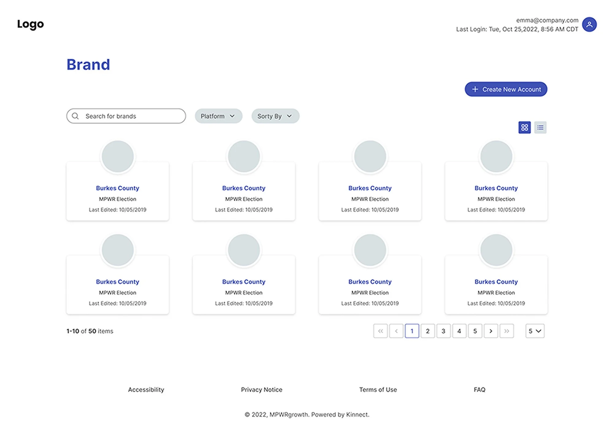
We ultimately chose the Prime Vue design library due to its alignment with the navigation style, block elements, and widget usage of the existing business management solution that the Admin Portal integrates with. These elements were critical to our design, as stakeholders specifically requested a more modernized UI and an enhanced user experience.
High-Fidelity Mockups
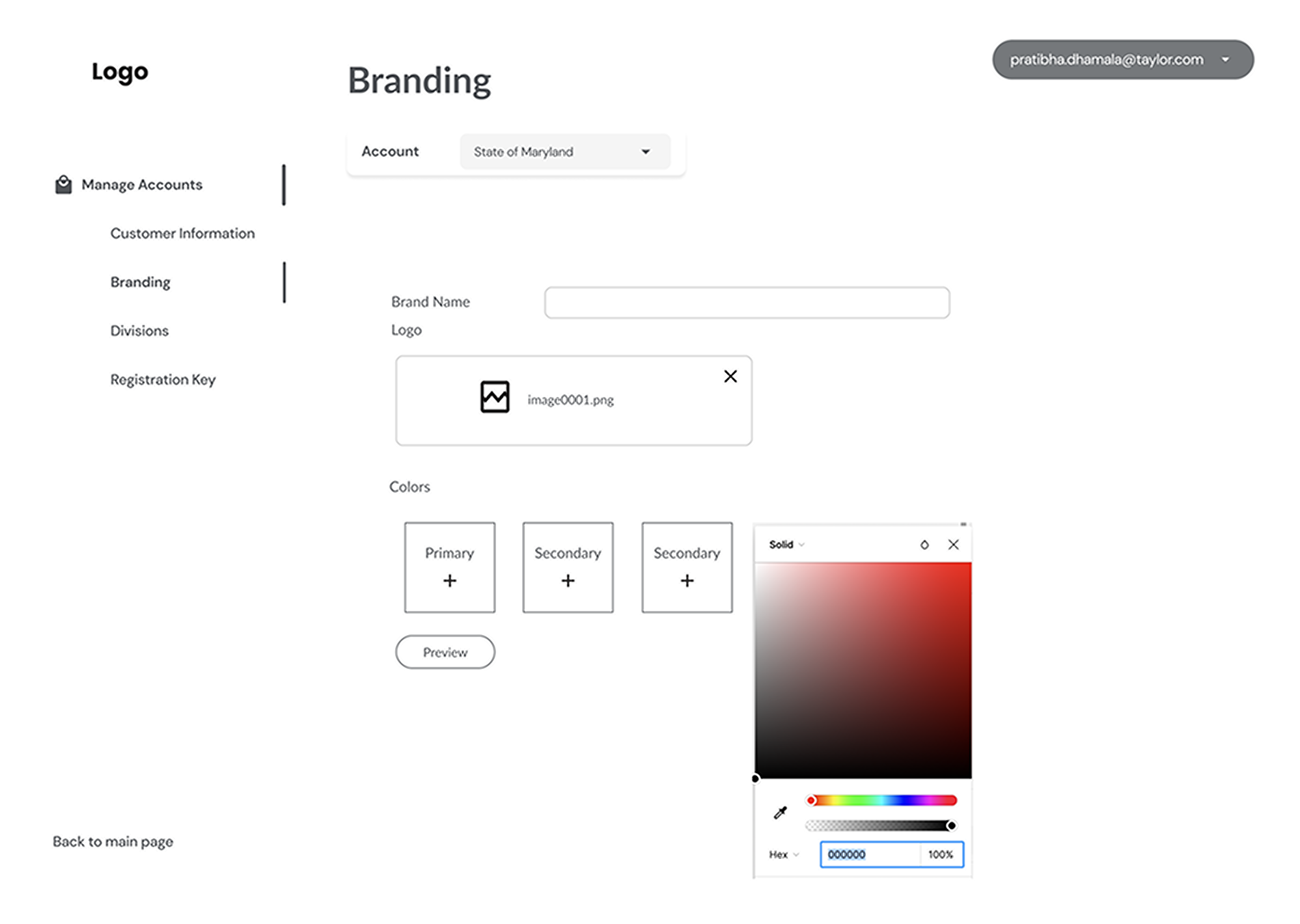
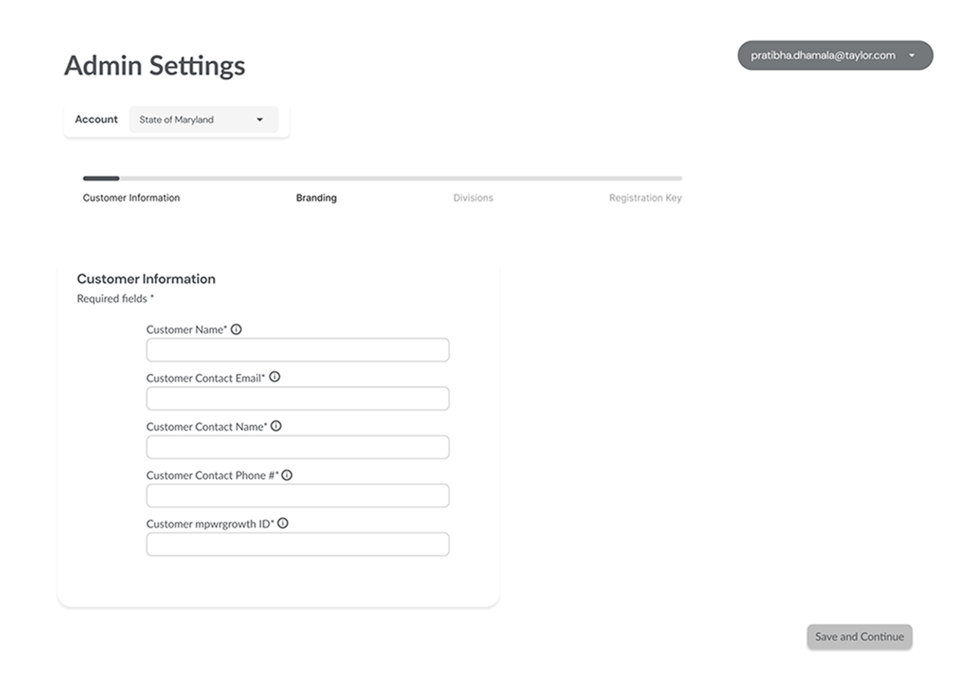
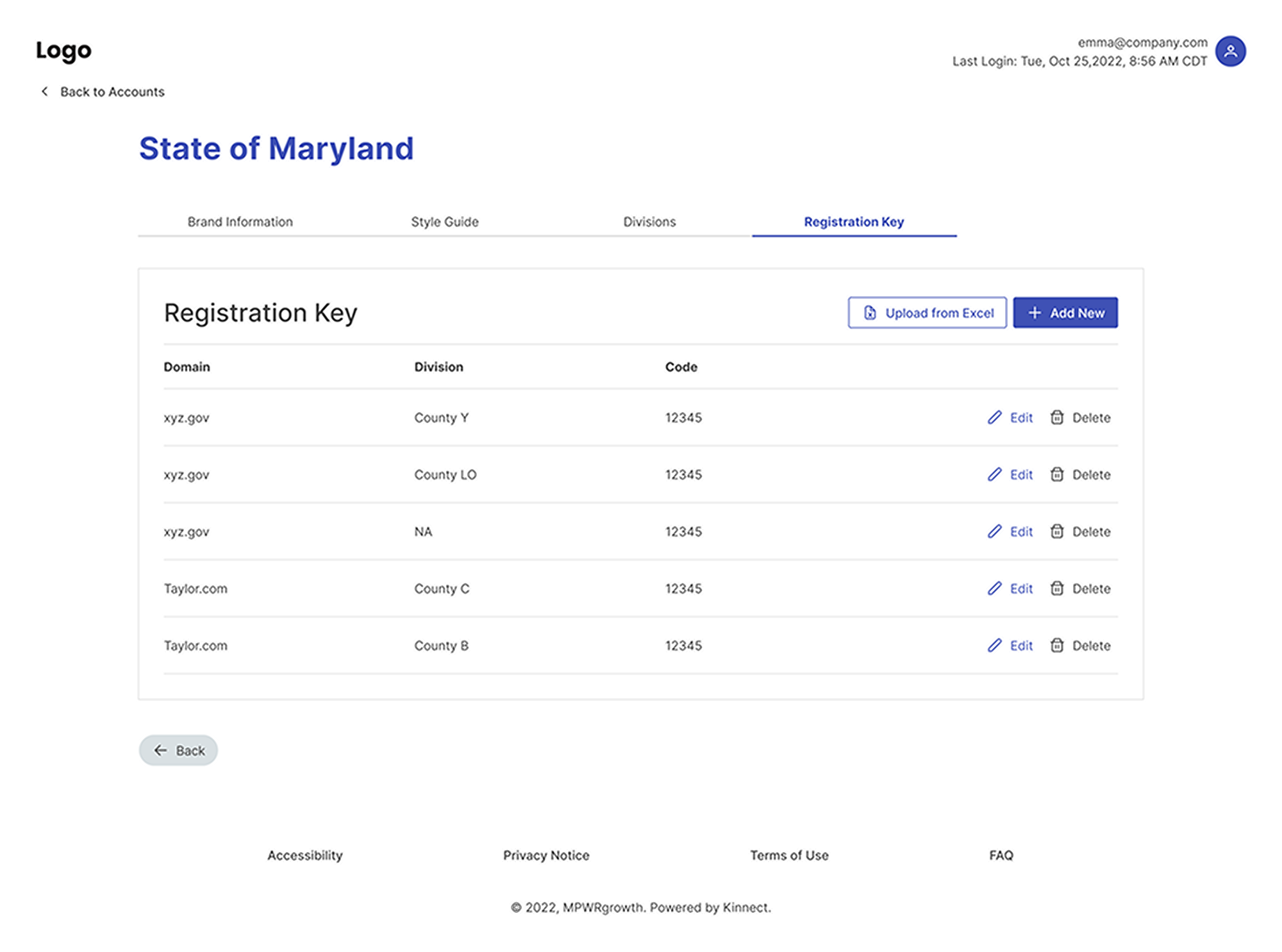
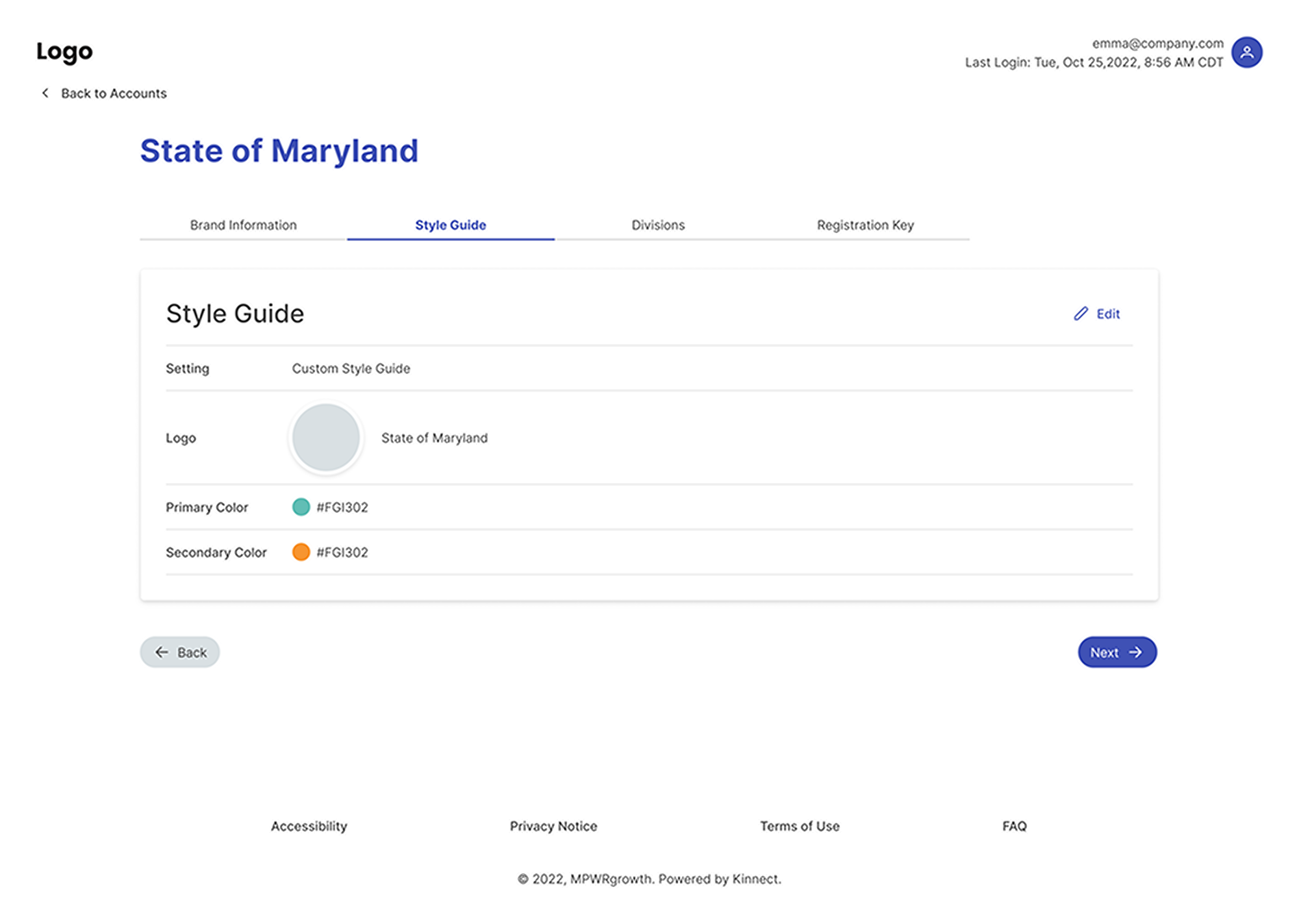
The scenario we used for the Admin Portal high-fidelity mockups centered around local government election officials.
Accessibility
Before finalizing our handoff, I consulted with our certified Accessibility Coach to ensure our designs adhered to WCAG guidelines. My primary focus was on readability, color contrast ratio, and navigation. I was pleased to confirm that there were no accessibility issues identified.
Prototyping & Testing
Upon completing our designs and handing them off to the development team, the IT project manager contacted us again, having realized that the future may involve 20+ user stories, which could significantly impact the user experience of the current navigation.
Our designs accounted for only five user stories, so this new information necessitated a substantial change to our navigation style. My colleague and I quickly created mock-ups for two navigation versions that would allow the development team to easily implement future stories while maintaining an effortless experience for end users.
Testing Plan
I conducted six unmoderated A/B usability tests through UserTesting.com. Recognizing that the end-users for this project would be government election officials, we screened participants by their job titles, fields of work, level of computer proficiency, and language. The test comprised 11 tasks in total, comparing the two different versions of navigation.
Test Findings
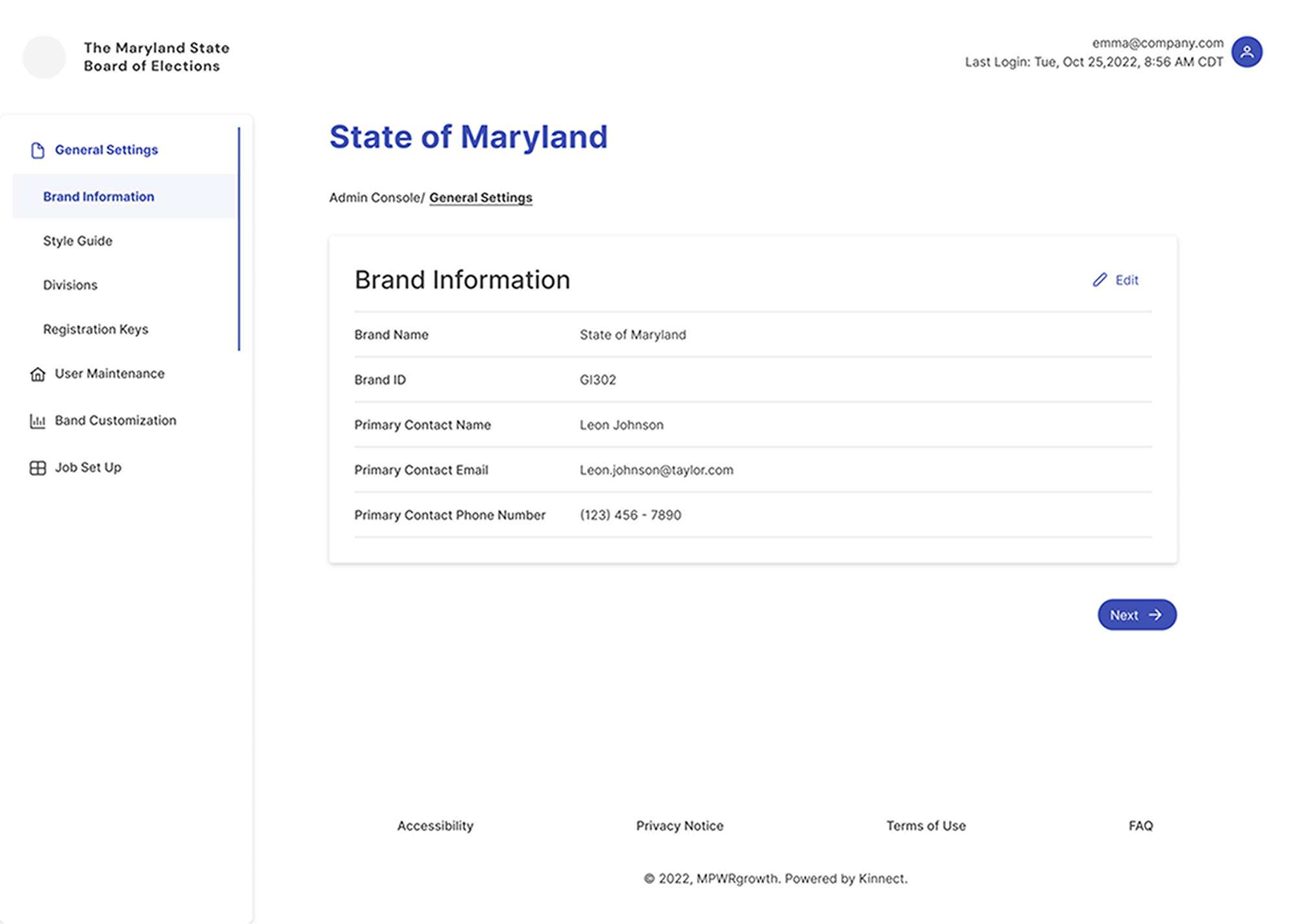
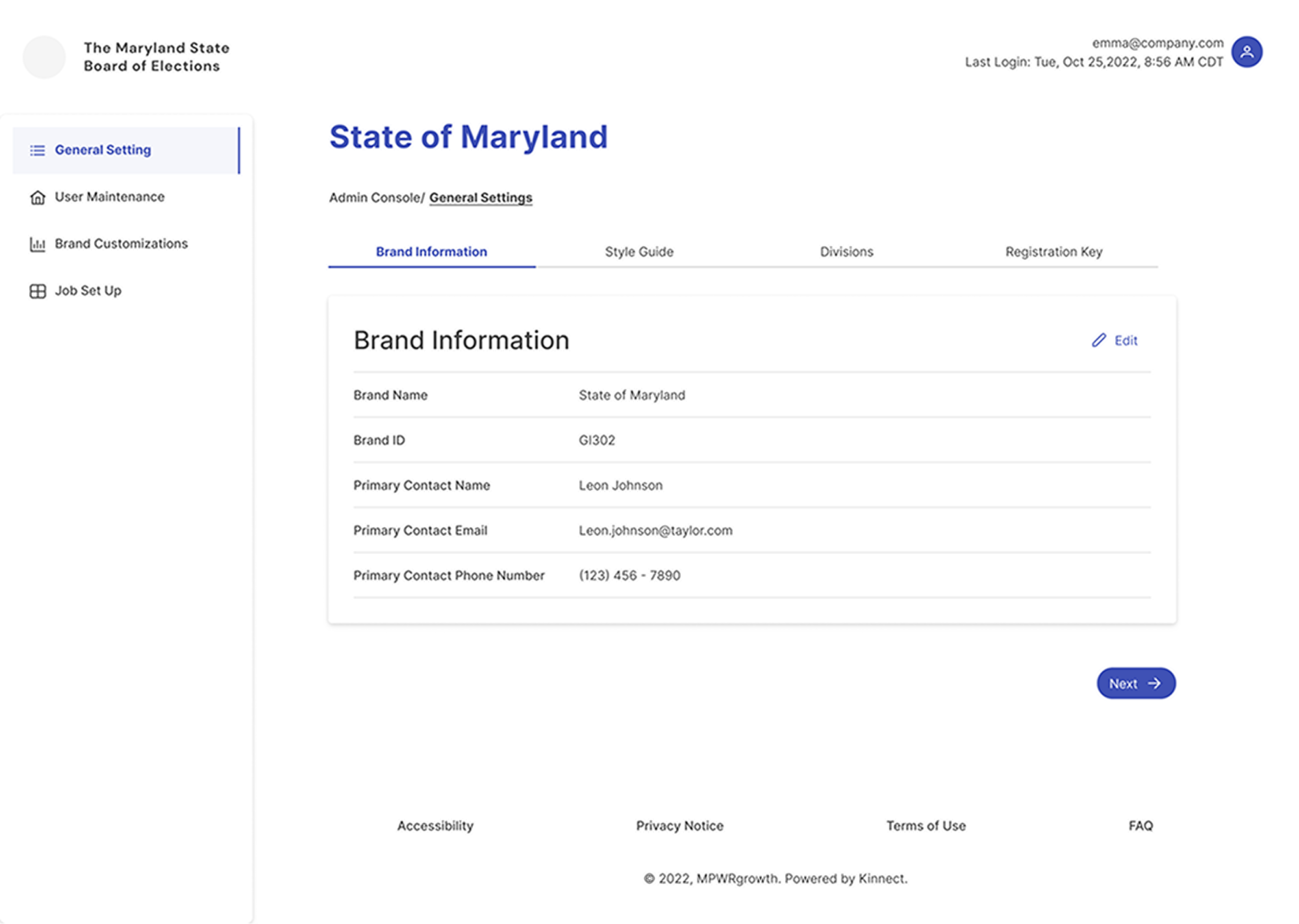
To my surprise, four out of six participants preferred Version A with the side navigation only. They found it easier to navigate as the navigation was consolidated in one area, providing a cleaner look and feel, which contributed to consistency and trust. All six participants successfully completed the tasks.
Based on the users' feedback, no additional changes were made to our designs. I presented our test findings to the key stakeholders and the development team for further implementation.
Version A showcased side navigation that allows for vertical expansion
Version B utilized side navigation and tabs on each page as a means of sub-navigation
Challenges, Conclusion & Recommendation
Challenges
The primary challenge for this project was communication, particularly concerning future development ideas and the project's long-term expansion. This experience underscored the importance of proactively addressing forward-looking questions. While the project demonstrated effective communication, especially within our direct collaboration with the development team and the utilization of the design library, improving communication remains a priority for future projects.
Conclusion
I am pleased with our work utilizing the new design library and the process and outcomes of the initial round of usability testing. I am confident that our collaboration with this team will continue to improve as we refine our working relationships. User research is not always readily embraced, so I am gratified that I could demonstrate its importance in making informed decisions. I look forward to integrating user research at earlier stages in future projects with this team.
Recommendation
As this portal is set to go live for the first time, I recommend collecting data from users and conducting user interviews in the near future to evaluate what is working well and identify areas for improvement at this early stage.
